Overview
EDFI needed to separate its activities into two distinct entities, EDFI and EDFI Management Company, each with its own public website (edfi.eu and edfimc.eu), while preserving clarity, credibility, and continuity within a shared institutional ecosystem. In parallel, an internal, password-protected web application was required to manage classified documents for internal use only.
Problem
The main challenge was to clearly distinguish two organisations with overlapping audiences and content, without creating confusion or weakening EDFI’s institutional credibility. Users needed to immediately understand which entity they were interacting with, while still perceiving both platforms as part of a coherent ecosystem. At the same time, internal stakeholders required a secure and efficient way to access sensitive documentation through a dedicated internal tool.
My Role
I was responsible for the UX and interface design of both public websites as well as the internal web application. My work focused on defining navigation logic, content structure, and interface clarity across the two entities, while ensuring the internal platform remained secure, readable, and easy to use.
Constraints
The project involved strong institutional expectations, shared content between entities, and the need for differentiation without visual overload. The internal application introduced additional constraints related to authentication, access control, and document classification, requiring a clear information hierarchy without unnecessary interface complexity.
UX Approach & Key Decisions
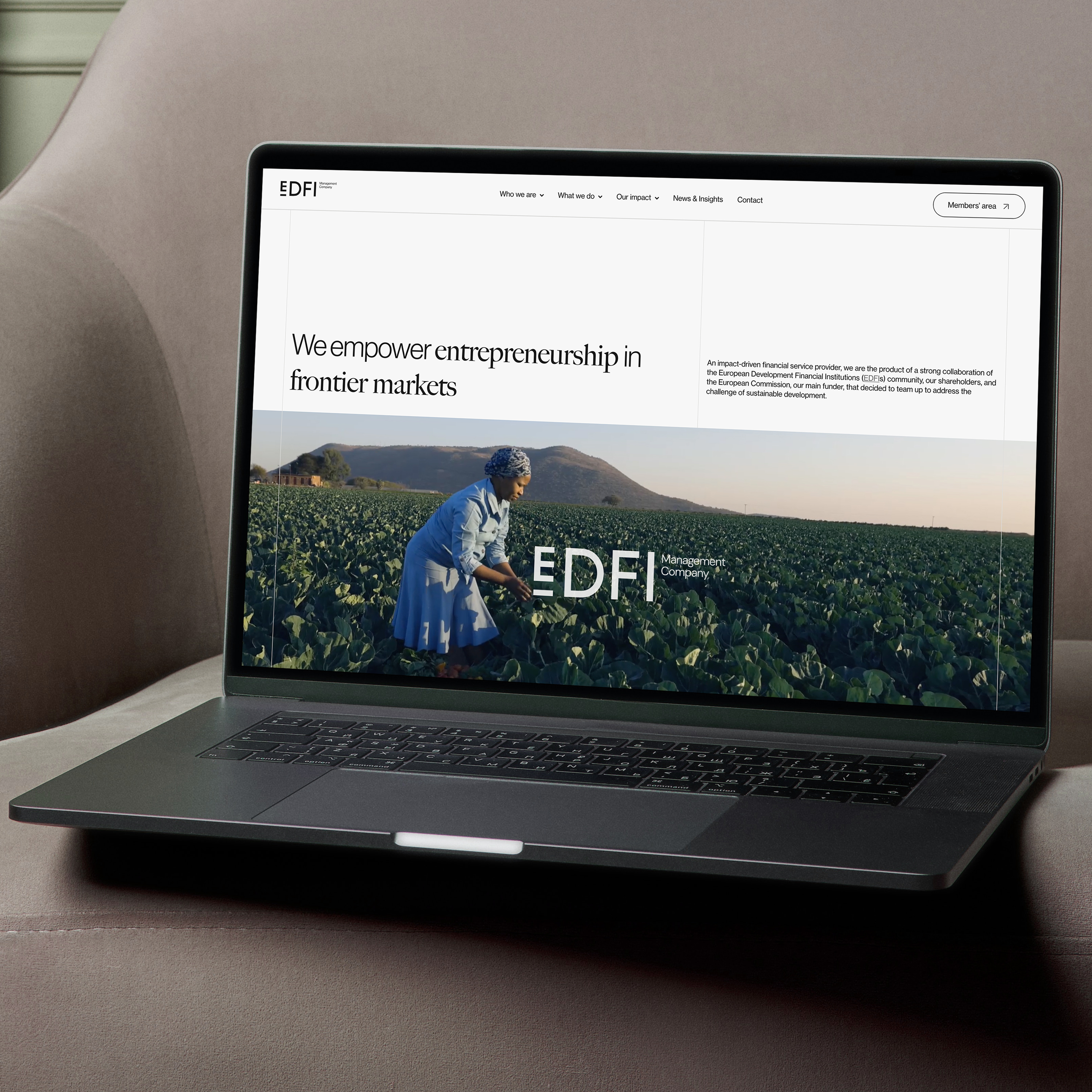
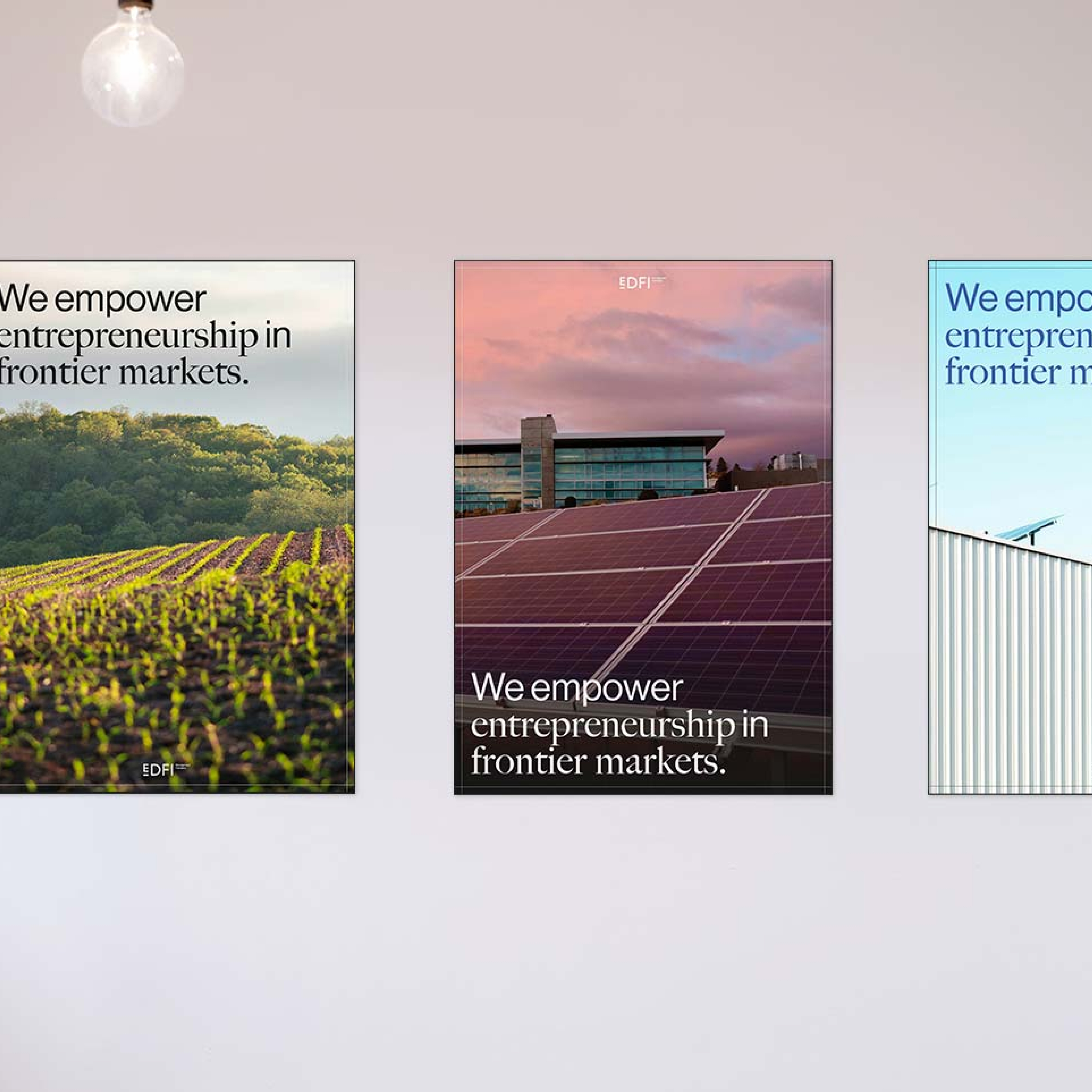
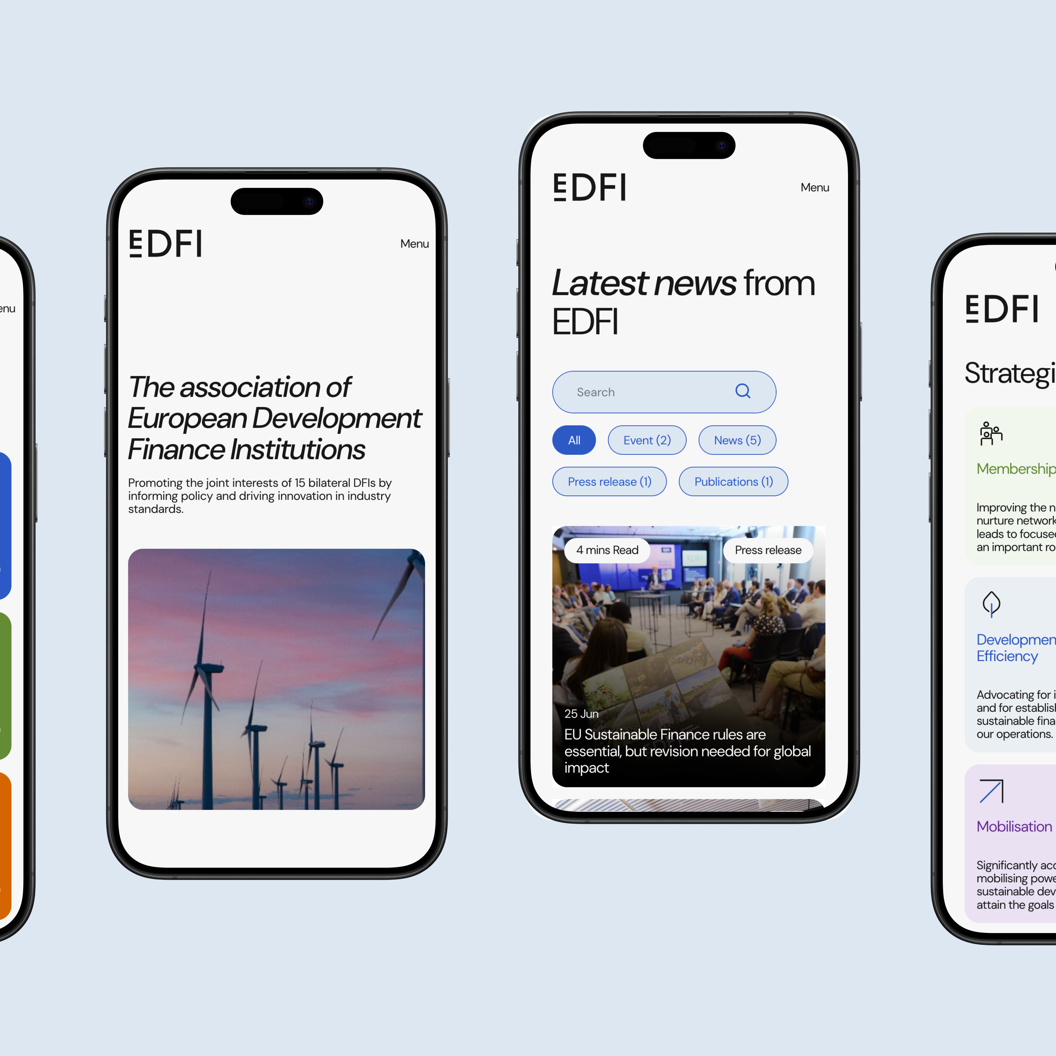
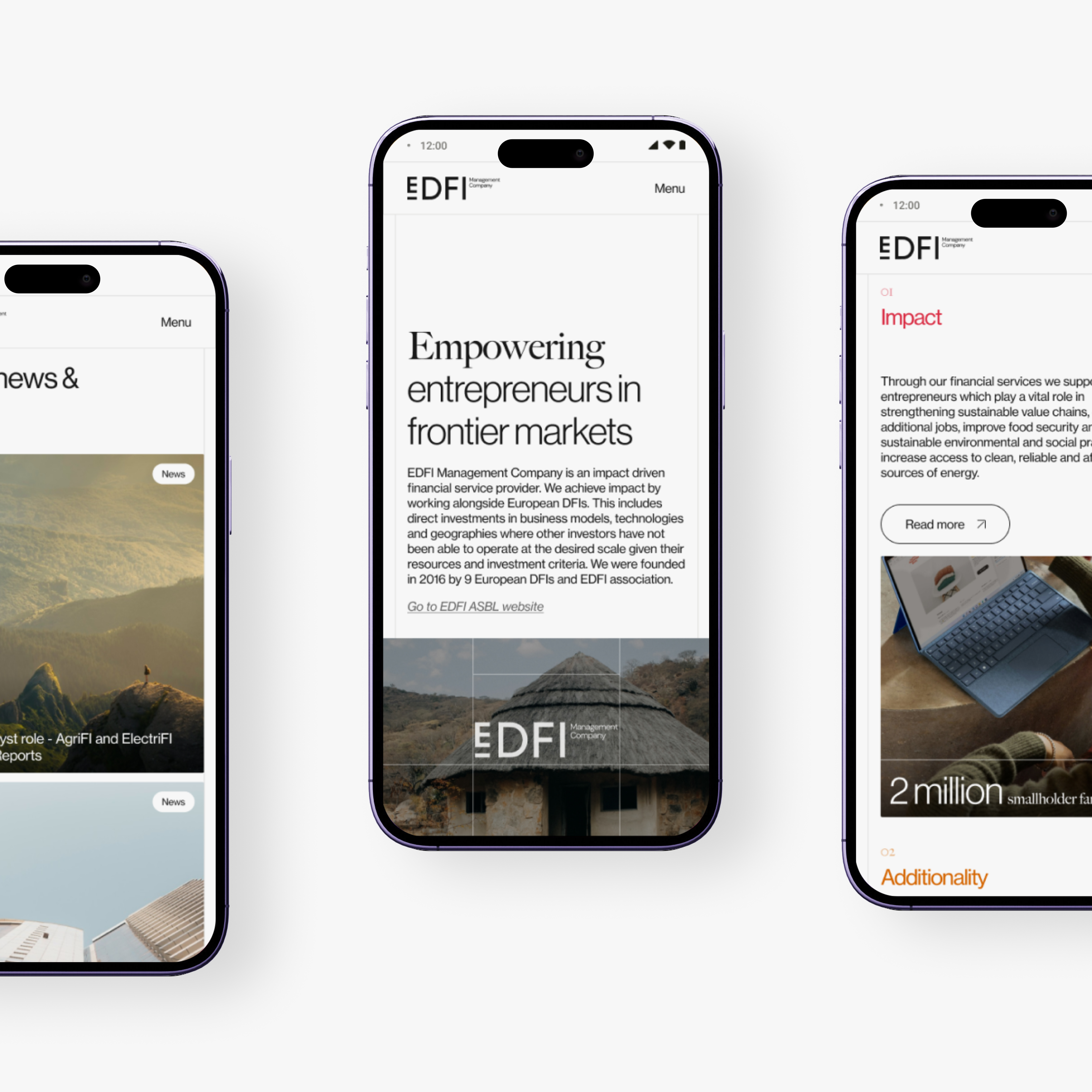
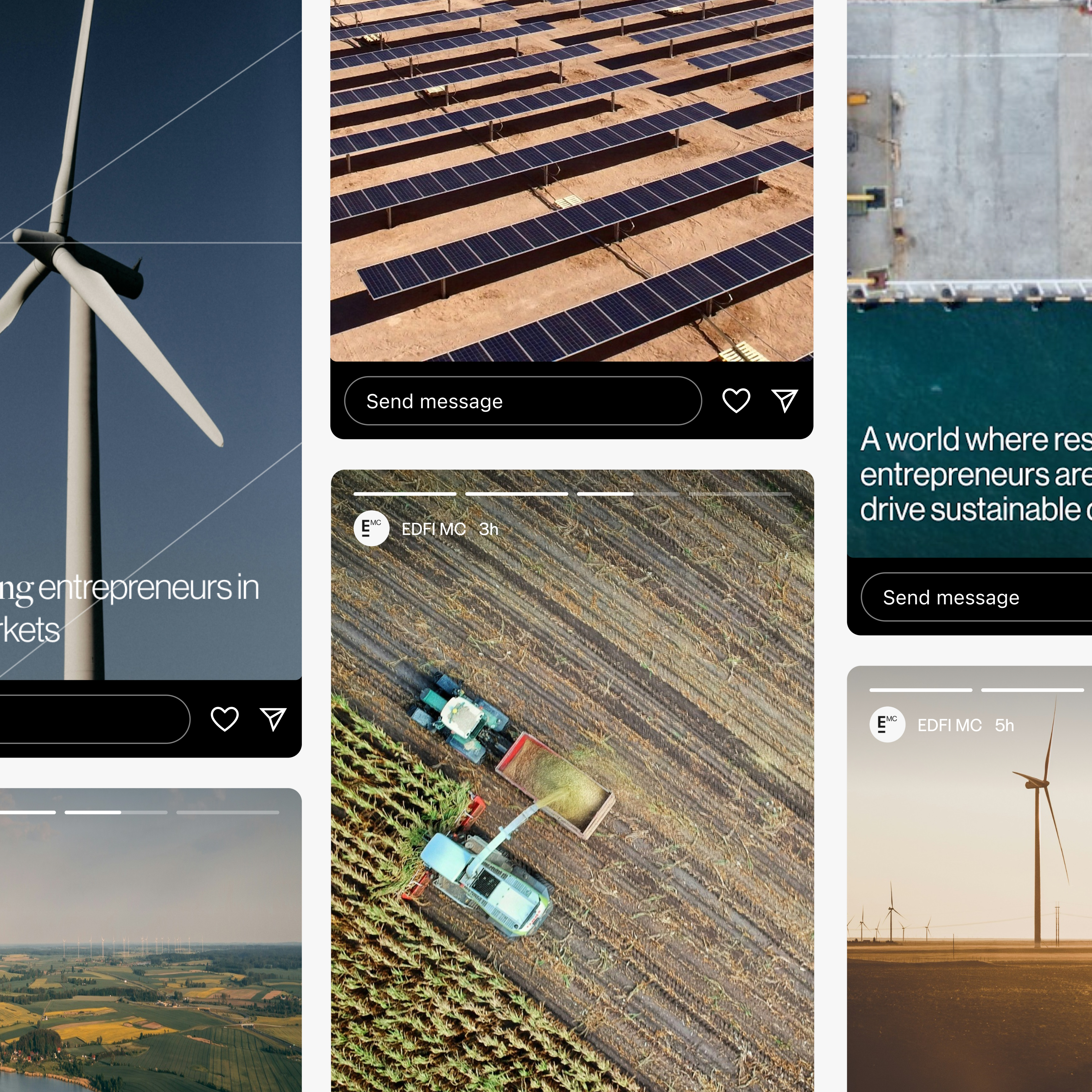
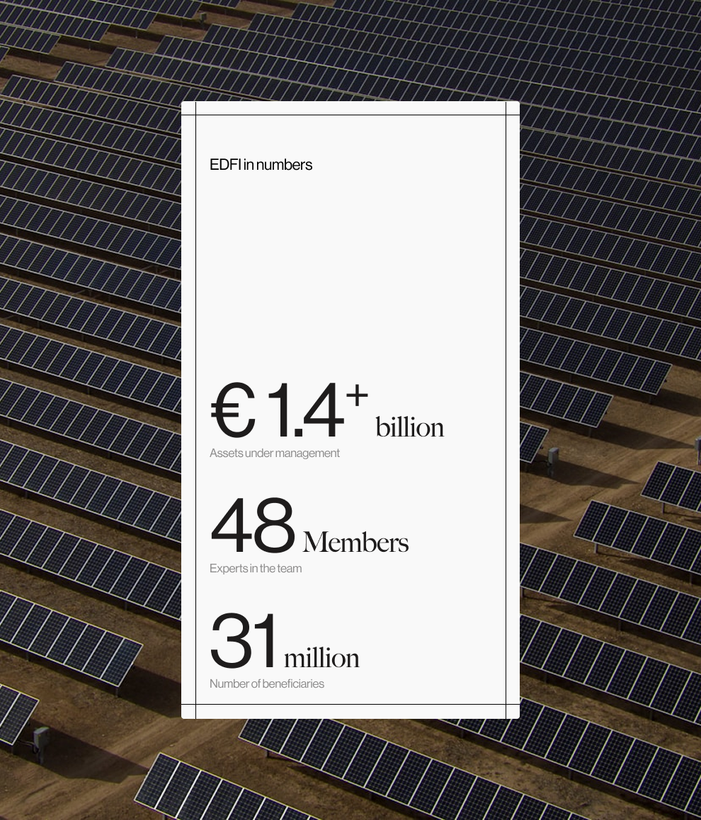
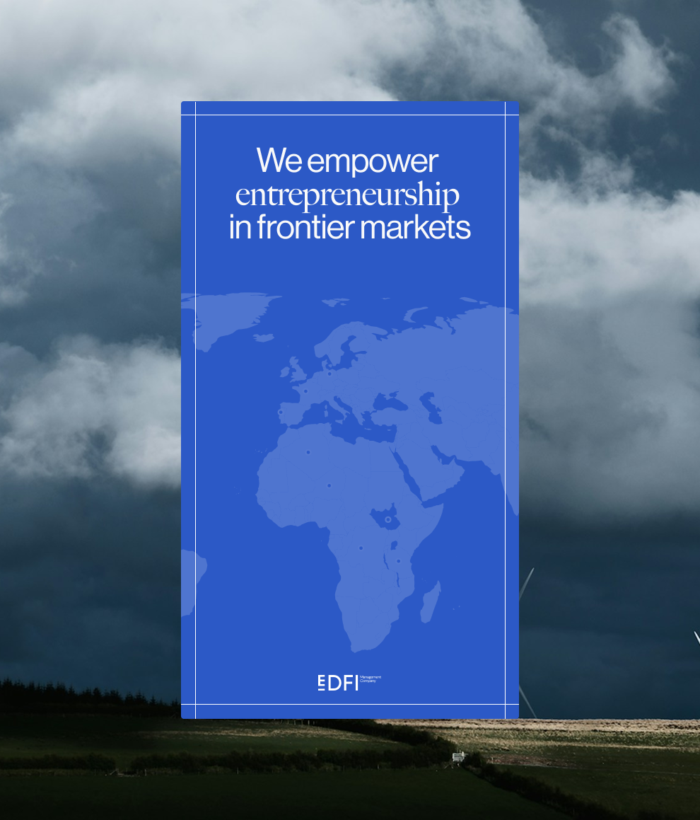
Both public websites were designed on a shared structural foundation to reinforce ecosystem coherence, while differentiation was achieved through content framing, hierarchy, and contextual cues rather than heavy stylistic divergence. Page structures and navigation elements were designed to immediately signal whether the user was browsing EDFI or EDFI Management Company. For the internal web application, the focus was placed on secure authentication, clear categorisation of documents, and fast access to sensitive information, prioritising usability over visual effects.
Interface & System Design
The interfaces were built using modular components to ensure consistency, scalability, and efficient collaboration with development teams. Design decisions prioritised readability, predictability, and long-term maintainability across both public and internal platforms.
Outcome
The result is a coherent digital ecosystem composed of two clearly differentiated public websites and a secure internal tool. External users can navigate between entities without confusion, while internal stakeholders benefit from a structured and reliable system for managing classified documents.
Reflection
With more time, the next step would be to validate user comprehension across both public platforms and refine internal workflows based on real usage patterns, ensuring the system continues to scale without losing clarity.

More projects
Structuring a content-heavy platform for medical professionals.
I redesigned the UX/UI of ESAIC’s content-heavy website to improve navigation, accessibility, and clarity for medical professionals.
Structuring complex AI and automation services into a clear digital experience.
I designed the UX/UI to structure and clarify Maiva’s AI and automation services into an understandable digital experience.
Translating an AI value proposition into a clear landing experience
I designed the UX/UI of Qontact AI’s first landing page to clearly communicate the product’s value and support early conversion.