Overview
ESAIC is a professional organisation for anaesthesiology and intensive care specialists, hosting a large volume of educational, scientific, and institutional content. Over time, the website had grown without a clear structure, resulting in a complex and fragmented information architecture that made navigation difficult for users.
Problem
The existing website structure had become increasingly difficult to understand, both for first-time visitors and regular users. Content was scattered across multiple sections without a clear hierarchy, topics overlapped, and key information was hard to locate. The main challenge was to completely rethink the structure of the website so users could quickly understand where they were, what content was available, and how to reach it efficiently.
My Role
I was responsible for the UX and UI design of the website. This included analysing and restructuring the information architecture, redefining navigation logic, and designing the interface to reflect the new structure through clearer layouts, consistent components, and improved readability.
Constraints
The project involved a very large number of pages and content types, with strong editorial and institutional constraints. Existing content had to be preserved and reorganised, and the interface needed to remain sober and accessible for a professional medical audience. The new design also had to be scalable to support future content growth.
UX Approach & Key Decisions
I began by mapping the existing website structure to identify redundancies, inconsistencies, and unclear groupings. Based on this analysis, I reorganised the content around clear thematic categories and user needs rather than internal organisational logic. The interface design was then built to reinforce this structure through clear navigation patterns, visual hierarchy, and consistent page templates, helping users orient themselves across the platform.
Interface & System Design
The redesigned interface focused on clarity and readability, with layouts and components designed to handle dense content without overwhelming users. Navigation elements, page templates, and typographic hierarchy were aligned with the new information architecture to ensure coherence between structure and interface.
Outcome
The result is a significantly clearer and more usable website. Users can now navigate content by topic more intuitively, understand the organisation of the platform at a glance, and access key information with fewer steps. The redesigned interface supports the new structure while remaining consistent and scalable.
Reflection
With further iteration, usability testing and analytics could be used to validate navigation efficiency and refine interface details, ensuring the platform continues to evolve without reintroducing complexity.
More projects
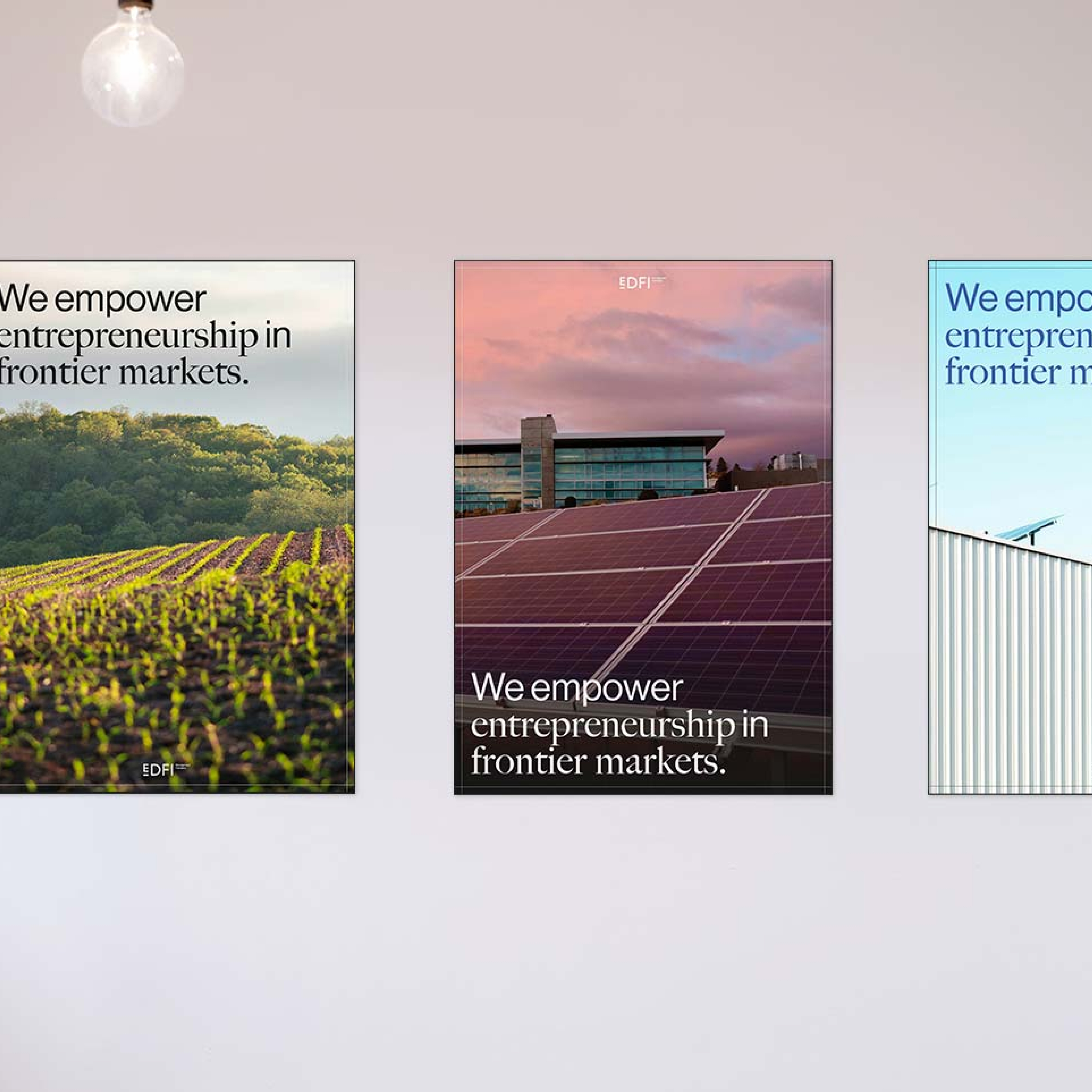
Clarifying a two-brand ecosystem across digital touchpoints.
I redesigned the UX/UI to support a split into two entities with clear differentiation, shared structure, and consistent trust signals across platforms.
Structuring complex AI and automation services into a clear digital experience.
I designed the UX/UI to structure and clarify Maiva’s AI and automation services into an understandable digital experience.
Translating an AI value proposition into a clear landing experience
I designed the UX/UI of Qontact AI’s first landing page to clearly communicate the product’s value and support early conversion.