Overview
Maiva is a company specialising in automation, AI, and systems integration for businesses. The project focused on designing the UX and UI of the website to clearly present complex technical services and make the offering understandable for non-technical decision-makers.
Problem
Maiva’s services are inherently complex and abstract, making them difficult to explain through a simple website. The challenge was to structure and design a digital experience that clearly communicates what the company does, how its services are organised, and how potential clients can identify relevant solutions—without oversimplifying or overwhelming users.
My Role
I was responsible for the UX and UI design of the website. This included structuring the content, defining navigation and page hierarchy, and designing the interface to support clarity, readability, and consistency across the site.
Constraints
The website needed to address a B2B audience with varying levels of technical understanding. Content had to remain precise while being accessible, and the design needed to feel professional and credible without relying on visual excess. The structure also had to be flexible enough to accommodate future service expansion.
UX & UI Approach
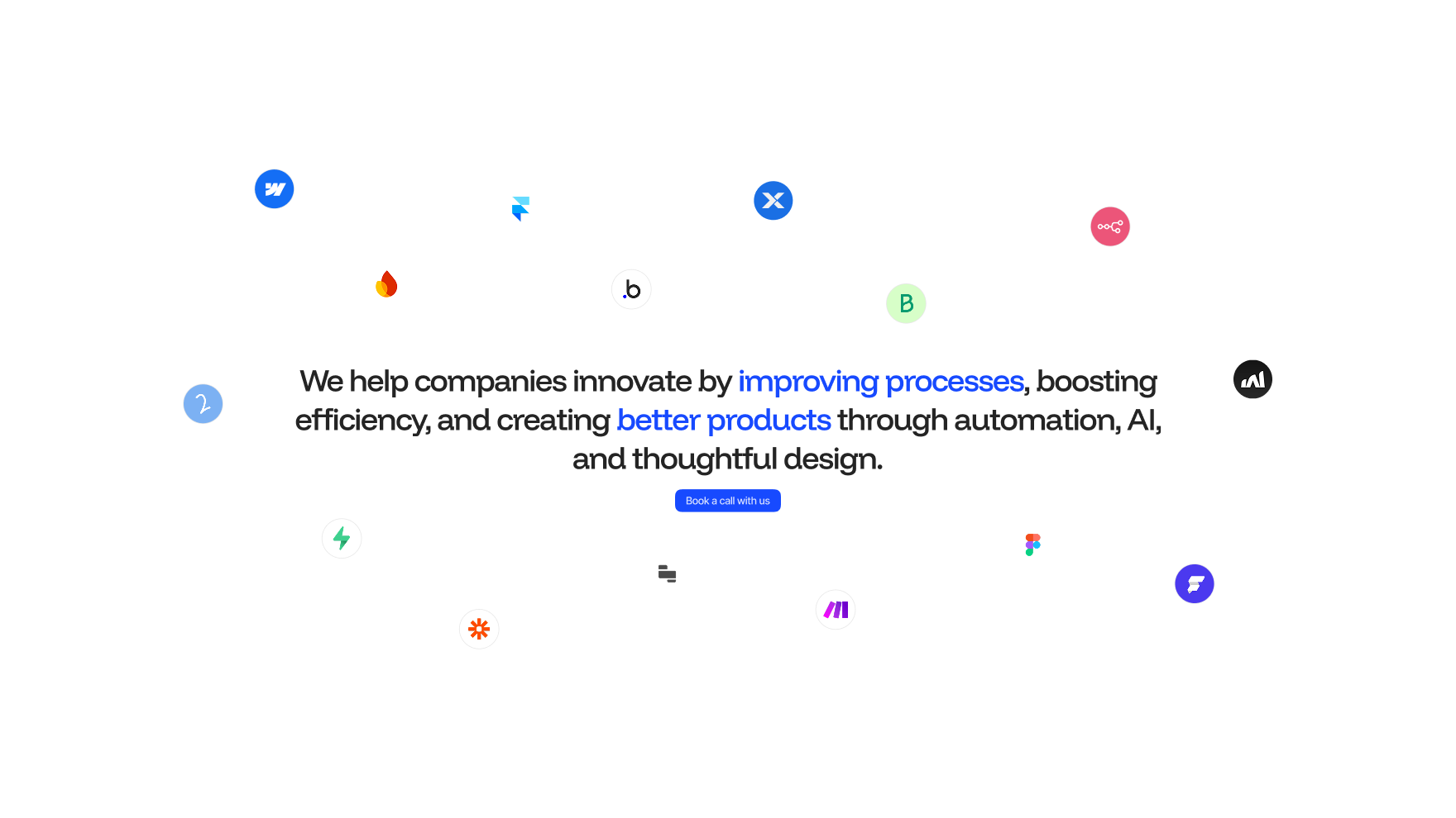
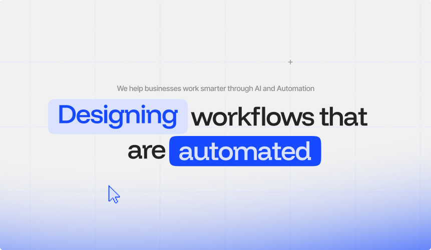
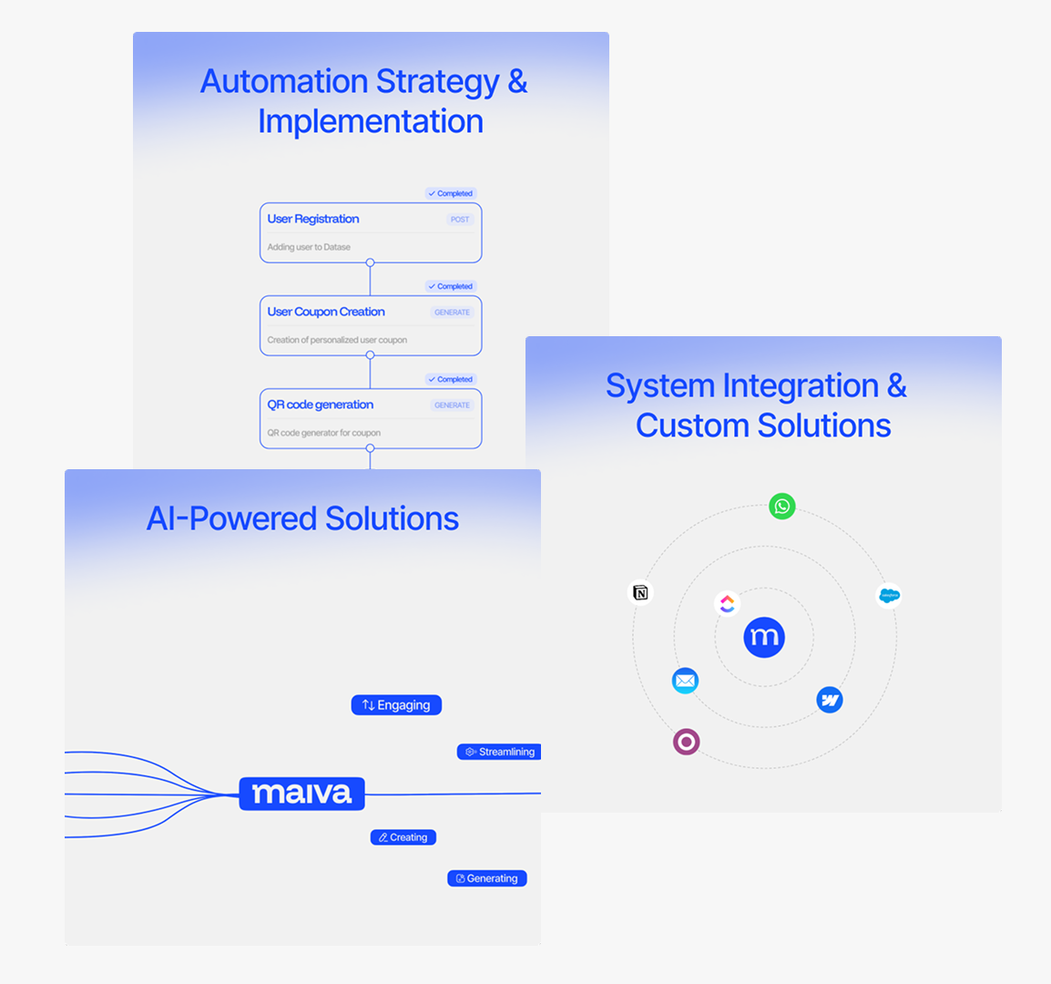
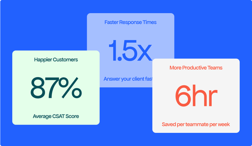
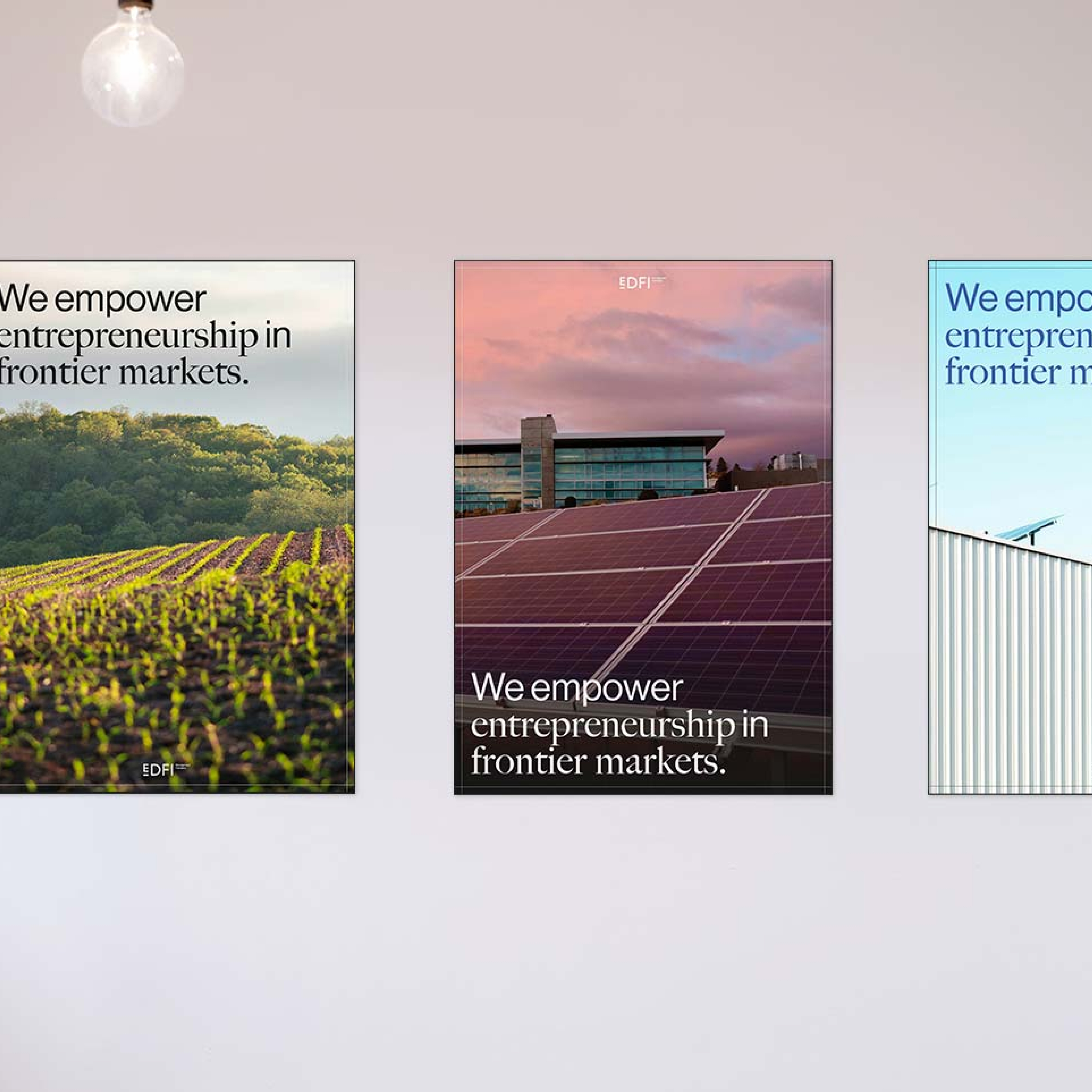
I structured the website around clear service categories and user intent, helping visitors quickly understand Maiva’s areas of expertise and how they relate to concrete business needs. The interface design reinforced this structure through clear layouts, consistent components, and a strong visual hierarchy that guides users through dense information.
Interface & Visual System
The UI design focused on clarity and coherence, using restrained visual elements, consistent spacing, and predictable navigation patterns. Components were designed to be reusable and scalable, ensuring the website could evolve without losing structure.
Outcome
The resulting website presents Maiva’s services in a clear and organised way, making complex topics easier to understand and navigate. Users can quickly grasp the company’s expertise, explore relevant services, and identify next steps without confusion
Reflection
With further iteration, the next step would be to validate content clarity through user feedback and refine service pages based on how users navigate and engage with the information.
More projects
Structuring a content-heavy platform for medical professionals.
I redesigned the UX/UI of ESAIC’s content-heavy website to improve navigation, accessibility, and clarity for medical professionals.
Translating an AI value proposition into a clear landing experience
I designed the UX/UI of Qontact AI’s first landing page to clearly communicate the product’s value and support early conversion.
Clarifying a two-brand ecosystem across digital touchpoints.
I redesigned the UX/UI to support a split into two entities with clear differentiation, shared structure, and consistent trust signals across platforms.