Overview
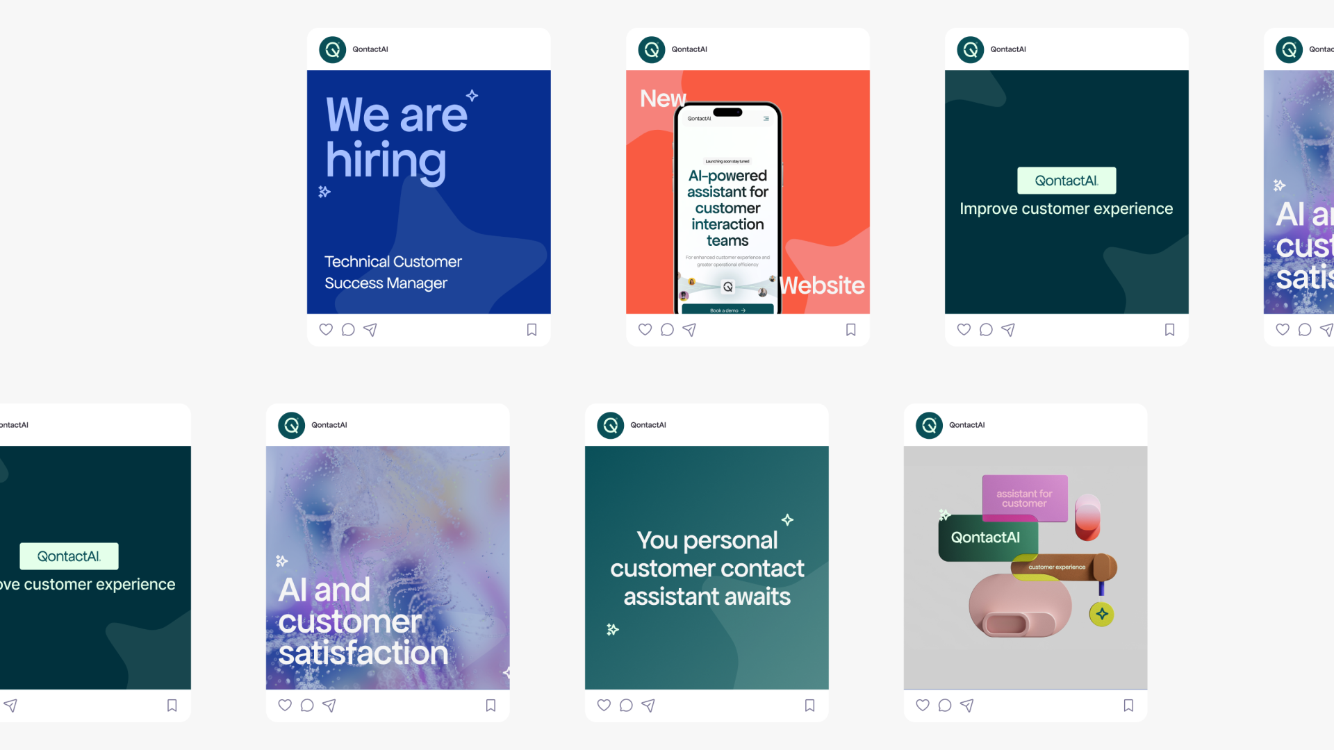
Guidnce (formerly Qontact AI) is an early-stage product preparing its first public launch. The objective was to create a clear and credible first digital presence through a landing page, while defining the initial visual identity of the product. This included UX/UI design as well as basic brand foundations such as logo, color palette, and visual language.
Problem
As a first launch, the product had no existing digital presence or visual identity. The challenge was to quickly communicate what the product does, for whom it is designed, and why it is useful—without overwhelming users or overexplaining a still-evolving product. The landing page needed to be clear, focused, and flexible enough to evolve with the product.
My Role
I was responsible for the UX, UI, and initial brand design. This included defining the structure of the landing page, designing the interface, and creating the core visual elements such as the logo, color system, and basic identity guidelines.
Constraints
The project had to move quickly and remain lightweight, as the product was still in an early stage. The design needed to balance credibility and simplicity, while leaving room for future iterations as the product positioning and features evolved.
UX & UI Approach
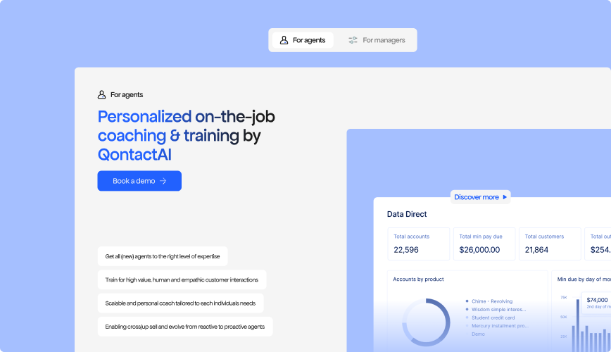
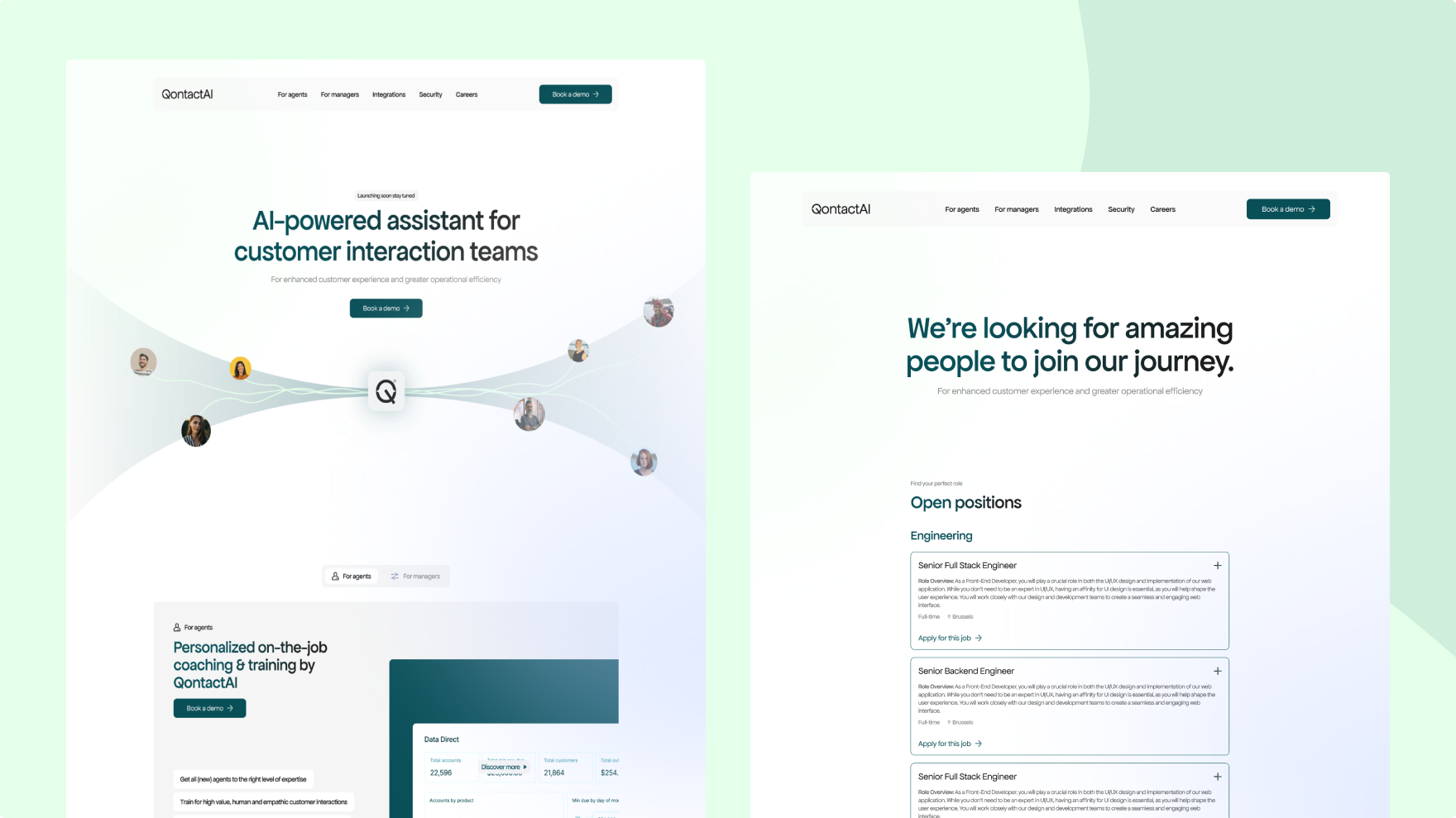
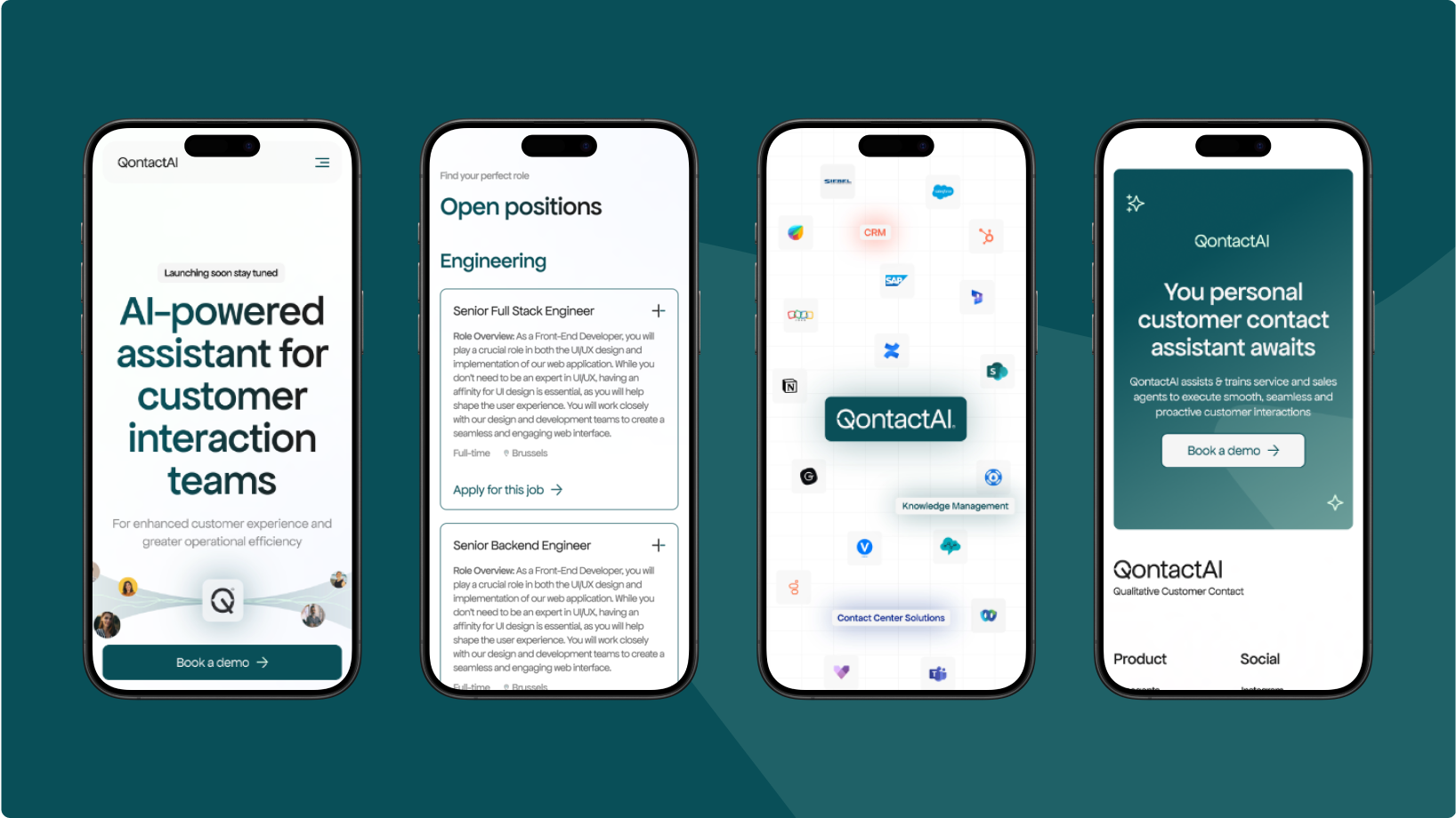
I focused on structuring the landing page around a clear value proposition and a simple narrative flow, guiding users from understanding the product to taking action. The interface design prioritised readability, hierarchy, and consistency, while the visual identity was designed to be minimal and adaptable rather than overly prescriptive.
Interface & Visual System
The visual system was intentionally restrained, using a limited color palette and simple typographic hierarchy to support clarity and focus. The logo and interface elements were designed to work together as a coherent whole, reinforcing recognition without distracting from the product message.
Outcome
The result is a clear and coherent landing page that establishes Guidnce’s first digital presence. The product is introduced in a way that is easy to understand, visually consistent, and ready to support early user acquisition and future iterations.
Reflection
With the evolution of the product, the next step would be to refine the content and interaction patterns based on user feedback, and gradually expand the design system as the product matures.
More projects
Structuring a content-heavy platform for medical professionals.
I redesigned the UX/UI of ESAIC’s content-heavy website to improve navigation, accessibility, and clarity for medical professionals.
Clarifying a two-brand ecosystem across digital touchpoints.
I redesigned the UX/UI to support a split into two entities with clear differentiation, shared structure, and consistent trust signals across platforms.
Structuring complex AI and automation services into a clear digital experience.
I designed the UX/UI to structure and clarify Maiva’s AI and automation services into an understandable digital experience.